Mittwoch, 7. Mai 2014

The 18th and 19th Century-Architecture and the Industrial Revolution

The 18th and 19th century stood for the age of revolution and development of society. The development of factory and machines to supply the needs of the people changed architecture as well.

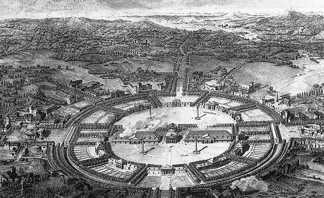
Here we have Claude-Nicholas Ledoux, an important architect in the 18th century and favorite of King Louis XV of France, and his plan of Chaux, which shows the idea of an ideal city. It is a mix of both a city and factory, combining people who live nearby the factory to be at the same time employers of it.


Indeed Ledoux was the favorite architect of the monarchy as well as of the aristocracy, but because of that he would be hated by the common people, especially after designing the Hotel de Thellusson, a gateway for a city wall around Paris. After the French Revolution it got destroyed.


The big change though came in the 19th century with the Industrialization.  It was the era of the material steel, which will be used in architecture more and more. Despite the new material, architecture didn’t change much in look at the beginning. A.W.N Pugin, author of the book Contrasts, compared ancient and modern towns and came to the conclusion that people need to go back to the beautiful moment of the past, when Arts and Crafts had a stronger meaning. Pugin indeed was afraid of this fast development of the society in Great Britain such as big factories, mass production and railway tracks. For him as thus, the most beautiful moment was the era before the mass production.
It was not for too long that Britain would hold an International fair to show its strength and greatness of the empire. As thus, a huge complex has to be built, that would show this greatness and strength as well as the innovation of the new material steel. It was Joseph Paxton then, who would design the so called Crystal Palace, a huge steel and glass structure, resembling a greenhouse. Despite the fact that it was huge, it was finished in quite a short time thanks to the prefabrication of steel elements.


Not long afterwards France would host the next Fair and Gustave Eiffel has been commissioned to construct the Eiffel Tower. Eiffel himself was at that time a well-known engineer and lots of his steel constructions can be found in Europe. As such he designed the Eiffel Tower in steel, the highest tower at that time, demonstrating what can be archived by using steel.


Despite the usage of the new material, architects never stepped out from the past styles, being still very decorative and organic. It was then, when architects started to think different and get rid of the past and all the movements, developing a new movement more befitting for this century. It was the start of the absence of decorations, which slowly started to dissolve with Louis Sullivan’s Architecture. Sullivan, who stated that Form ever follows Function, was still a bit decorative, but less than other architects. It was Adolf Loos and his Book “Ornament and Crime” that would put an end to the past architecture and decoration, starting a new movement. It was the Birth of Modernism.

Sonntag, 27. April 2014

Baroque - Catholics VS Protestants


The Baroque Style replaced the late Renaissance epoch. Its level of sculpturing was beyond of what the Greeks were capable of. In this style, they would play with high realism, no symbolism, no expressionism, purely stating what it is.

During the late Renaissance, artists would play with contrasts, remember Madonna with the Long Neck by Parmigianino?

Well in Baroque, it will be more dynamic, more dramatic. But lets begin with the historical context.
In this era, Christianity had its peek, it was still strong and influential like I talked in my last blog. So what changed? Members of the christian church got more powerful and very rich. the St. Peters is a god example for that. For some people it wasn't anymore the principle of the christian church like it used to be at the beginning of its establishment. More simple, more humble, a religion for the common people.
It was in fact a opposite movement to the Religion Roman people believed at that time, which was after all, all about showing of, rich in detail, usage of expensive materials etc...
So the christian religion wanted to address more the poor people, show that they are more connected to the people, a religion in which God would care for them. So for some people that wasn't the case anymore. One of them was Martin Luther, he would oppose the christian church, start a new movement which was called the Protestant. Martin Luther, a person whose idea was to lead Christianity back to its real root.
This of course caused a lot of trouble, the catholic church had to react to the new movement.
So what they did next, I wouldn't had expected in my wildest dreams. Instead of trying to become once again humble and simple again, the pope ordered to be even more elaborate in form and detail than before.

The idea behind it was simple, showing the people how strong and influential the catholic church is, making the Protestant movement look cheap and weak.

 Martin Luther nailing his complaints on a door of a catholic church, a total no- go

So how did this change manifest itself in Architecture? For that I will talk about 3 examples. The Nave of the St.Peter's by Maderno, Sixtus V's Plan of Rome and the Plan of the St.Peter's Complex by Bernini.

The Nave was build after the St.Peter's Dome had been build. Designed by Carlo Maderno, it was basically a big F**k You to Michelangelo, since the nave is so huge, that the Dome is mostly concealed by it and from the St. Peter's place not possible to be seen.  
The Nave transformed the Church from a Greek cross plan to a Latin cross plan, making it the biggest christian church in the world. It was the Pope who commissioned it, so that it would become the greatest and biggest church of all. This all for the sake of showing the people that the catholic christian religion was the most powerful religion of them all, especially towards the new Protestant church. 


This Picture shows clearly how the Nave blocks the view of the Dome

Baroque was also the era of the concept of urban planning, making the city more beautiful. Pope Sixtus V's Masterplan for Rome was such urban plan. It was one of the first of its kind and actually realized. He wanted to control the look and view of Rome, since its condition got more and more out of the hand. Rome should become a more pilgrimage friendly place for the christian people, so that they would easily pilgrim from one church to the next one. The new roads would connect the 7 first christian churches in Rome, visually pinpointed with the reusage of obelisks from ancient Egypt. 
But there was another reason for radically change the plan of the city. Since the roads in Rome where from medieval time, there was no general outline of roads. The where lots of small roads, which where unhygienic; people living near to each other are most likely to infect each other more easily. They where also very unsecure, it  was difficult to visually see criminals / crimes, especially Protestants. With the new urban plan and the long straight street, it would become more difficult for Protestants to hide themselves.


The last example i want to talk about is the Piazza in front of the St.Peter's. Designed by Bernini, the favorite artist of the Popes and the dominant one during the Baroque time. Is is a enormous place, huge, but just good enough for a huge church after all. It is flanked by colonnades, separating the space from the surrounding buildings. In this plan we can see, that baroque artists, unlike Renaissance artists, won't go with the strict geometric form. Instead of a perfect circle, you would end up with an oval form. Instead of a perfect square, it becomes a trapeze. All for the sake of distinguish themselves from the Renaissance style and to also give dynamic and movement to the forms. Make them come more alive. 


Sonntag, 20. April 2014

Renaissance and it's Identity

The Renaissance period followed after the Gothic era. The period get's more related to the classical architecture again.
This era was also the beginning of the christian world to crumble, for example the discovery of America by Columbus. The Knowledge is more spread throughout the people, Humanism becomes very important in the Renaissance. It is the spirit of learning, to get back the confidence in the ability of determine what is right or wrong on their own. Florence being one of the most important city during the Renaissance development.

Brunelleschi for example discovered the way of how to construct perspective and represent it. The Dome of the Cathedral at Florence is one of his master pieces. It is a combination of both Roman and Gothic architecture, using both styles to create this dome. To be more precise, the pointed arch from the Gothic era and the usage of voids in walls from the Roman style, creating a double shell roof


Da Vinci's Vitruvian Man became important for Brunelleschi, since the drawing was kind of the recipe for beauty and showed mathematical the aesthetic proportion. As such, Brunelleschi's Ospedale degli Innocent considered to be the first early Renaissance building, was based on proportion and geometry, using logical repetition of modules, which have been carefully calculated before.


Another example from Brunelleschi would be the Pazzi Chapel, which uses, in plan, simple geometric forms, namely square and rectangle. In this way all the elements relating to each other.


Also a very important figure during the Renaissance period was Donato Bramante. The Tempietto, a centralized church, which was inspired by sketches from Da Vinci, is agood example of a concept, using something massif in the middle and let it be surrounded by more delicate buildings.  The Tempietto, which is a very perfect building in circular shape will influence the St. Peter later.


Speaking of the St. Peter's in Rome. The Building was ordered by Pope Julius II to create a bigger dome than the one from the Pantheon. In plan it uses the Renaissance typical geometric form; a square with a tilted square which creates a centralized plan with symmetry. Unfortunately Bramante died before finishing the plan. It was never accomplished, the construction of the dome was too complicate.

Bramante introduced us to the Belvedere Courtyard, a building with 3 terraces and controlled circulation, which animated people to walk slowly and enjoy the garden. As such the garden becomes a place of socializing. He also used the term perspective vista, also known as bella vista, which was typical for renaissance gardens as well. It is the one place with the most beautiful view of the whole building.


My last example is Andrea Palladio, who stated that a good building should integrate the following three principles: Firmness, Commodity and Delight.
Palladio, trained as a stone mason, included in all of his architecture a strong system of proportions, which he found by studying ancient Roman buildings. He also came up with the urban palace, which looks less than a fortress and is thus more welcoming. But the one building I want to talk about is the Villa Americo Capra, also known as La Rotonda. It is Palladio's most famous building. It is pure symmetry, all parts are the same and even the building itself looks the same on all sites.


To conclude, Renaissance architecture is based upon mathematical proportions, which had been illustrated by Da Vinci's Vitruvian Man. Humanism has become a major part of this era, Christianity lost a lot of its relevance as the common people became more and more self-confident. Humanism is the spirit of learning, the will to acquire knowledge, which upon people can determine on their own what is right and what is wrong. As such the christian world crumbled, as the revolution of man and science became more and more relevant, for example the discovery of American Continent by Columbus or Galileo, who fought against the christian ideology and proved, that the sun is the center of the cosmos and not the earth.

As such, also architecture changed and became more profane and less sacral.

Sonntag, 30. März 2014

Diversity in Density - How users become part of the Architecture in the OPPO Flagship space

The last 2 entries I talked about the functions in the flagship space and the brand OPPO. In this entry I am going to address the issue of the users.
The users are the main protagonists of the whole design, it is for them we design a space in the first place. So how to make the user feel part of the architecture?

In my design, I put my flagship to be integrated in the Khlong Toei slums of Bangkok. Certainly not a place where a company would put their flagship in. Put what if the users are the inhabitants of the slums?
Diversity in density, every metropolitan city faces this; Bangkok, Tokyo or Hong Kong, to give some examples. Different cultural aspects come together to form a city in which architecture places the role of being the integrator, the merger for all these different cultures. In a slum, cultural aspects backgrounds aren't divers at all, but the density and the condition people live in is what makes a slum.


People living in density has one cause, lot of people, small areal space and thus resulting in high prices for 1sqm of land. In order to tackle he need for space real estates started to build in height. But in the end it didn't result in cheaper or more affordable apartments, so that many people still live in slums.

MVRDV, an architectural office based in the Netherlands tackled this issue, as in the Netherlands, land is expensive. So they proposed, in not a serious way, a high rised building for pigs, so that it is cheaper to hold them and feed them. The proposal was called 'Pig City'.

Pig City by MVRDV Architects

But back to my project. In my case the inhabitants of the slums are my users. And the architecture becomes the link between the users and the OPPO company, as OPPO produces a lot of affordable smartphones for people with small wages. So their main customers are the people with low income, living mostly in the slums. 
So the users can use the space to their free will, the space provides sitting areas, a big screen to watch television on as well as 24/7 WIFI access for the people. 
But this is what has been provided for the user, so how do the users become part of it as well? It is a simple space, a space that looks modern, yet uses familiar materials for the users. What the space provides is what the users should become part of. It should be a place of exchanging, people can meet, be together, talk, drink and eat together while watching TV. People come together and the bond, the community becomes stronger. The inhabitants have a strong bond with each other, but it should be more promoted. The OPPO flagship space can be seen as an Italian Piazza, a place for gathering, a place to meet and do things together. And in Italy, this principle of a piazza works very well and becomes part of an cities identity. 

Not the slums are huge, closing a big area. In a way I can say it is like a small city within a bigger city. And as such the slum should be treated, there are other movements going on, some different kind of laws the motion of the slum is different than Bangkok. And as such, why shouldn't it have its own piazza? Bangkok many places for social gatherings, example Siam Square, but the slums don't have this. And this is where the flagship should be seen and how the users become part of it. The Architecture won't work if people don't come and start to make social gatherings and use the space as part of their slum, their own city with a piazza.

Sonntag, 23. März 2014

About Robert Venturi's "Complexity and Contradiction in Architecture" and OPPO

In my last blog I talked about my brand of choice, which in this case was the OPPO company. I was talking about how architecture can be used to symbolize certain features of this company.

Robert Venturi talked in his 'gentle manifesto' about the commercial stripe in Las Vegas, USA. Here architecture becomes symbolic, a box could become a church or a palace. But what it truly is about are the signs, that support the space. So a street sign becomes part of an architecture, symbols become one with the space, to give the feeling of what is desired. How can this be applied to my brand?

Well Venturi talked about this "Duck house", the so called Long Island Duckling. The shape of the house correspond to what is sold inside, so in a way the house becomes a street sign as well. So should my future space be a huge smartphone like commercial building and act as a connection between outside and inside?
Or another example would be the so called "decorated shed", a box with an independent street sign that shows what inside the box happens.


I think implementing both examples to create the language of my brand surely would be too much, rather than being to symbolic and maybe become to ironic, I will have to look deeper and further into the matter of the OPPO brand.

I agree with Robert Venturi that the architectural language from the modernists may be plain and that all that matters is the plan. As Venturi said in his manifesto 'Words and symbols may be used in space for commercial persuasion.' For me this means that symbols are here to guide and help people to understand the space. 'If the plan is clear, you can see where to go.' is true as well, but people see spaces different than the architect may see it in plan. After all it is theoretically. The human mind works different on everyone, anyone has a different point of view of something. So why making general assumptions?

So what I want to emphasize on is on the people that will use the space. I can make a huge sign that says that here is the OPPO flagship space. But will a person benefit from it? I say no! People benefit from what is inside and the function program within the space. That is what people truly benefit from. In my case I try to create a space which addresses the people with low income, people who live in the slums. Well surely there is no need to make a sign that this is a slum right? So why would I label my building? Rather than that it should show itself in the architectural language and at the same time shouldn't be to dominant. It should please the people who use the space.These people, in my opinion, won't mind if I use marble for the flooring or limestone. For them the function of the space and the possibilities of it comes first. And I think that is something that can't be displayed by just be symbolic, using a sign or creating a facade which correspond only commercially and not on a more human scale.

For my that is the nature of my building, to be a bit humble and human in scale, but be precise to address the right people in the right place.
Yes it is true what Venturi observed in Las Vegas and that it is a commercialized space after all. But for my Flagship space, I would rather go with symbols which are not straightforward. The language of my space should be connected to what the brand stands for, but it should also connect the people to it. After all, the architecture is the link between the people and the brand.

Samstag, 15. März 2014

The OPPO Flagship space

In this blog entry I am going to talk about my idea for a flagship space for the OPPO company.
First of all, I would like to talk a bit about the brand OPPO. OPPO is a Chinese smartphone producer, having 3 additional production spaces in Thailand, Indonesia and Vietnam. The company produces especially smartphones for low income people, but still having high class smartphones in their product palette as well. The N1 for example is OPPO's current flagship smartphone and can compete with Apple's Iphone 5s and Samsung's Galaxy S4.

For more information about the brands and about the social groups around OPPO please have a look under this link. There a 2 booklets that I made as a part of the research analyze for the flagship space that I currently working on.


Before I am going to talk about my design intentions and how they are related to the OPPO company, I wrote a brief that would explain my ideas and thoughts of the space as well as what functions it should have:
 
PROJECT DESCRIPTION
 
THE PROJECT FOR THE OPPO COMPANY SHOULD ADDRESS THE PEOPLE FROM THAILAND WITH LOW INCOME. PEOPLE WHO EARN 20,000 BAHT PER MONTH OR MINIMUM 300 BAHT PER DAY ARE CONSIDERED AS PEOPLE WITH LOW INCOME.

PEOPLE FROM THIS CLASS LIVE AND INTERACT MOSTLY AMONGST THEMSELVES. THEY LIVE UNDER MINIMUM CONDITIONS, MOSTLY IN SO CALLED SLUMS OR IN PROVISIONAL HUT BARRACKS. THEY OWN SOME TECHNOLOGIES, MOSTLY PHONES OR SMARTPHONES, TELEVISION, RADIO AND TABLETS.

THE SITE IS IN KHLONG TOEI DISTRICT, WHERE THE BIGGEST SLUM IS LOCATED. BUT THERE ARE OTHER THINGS GOING ON IN THE DISTRICT AS WELL.  THE EMPORIUM AND THE LUMPINEE BOXING STADIUM ARE LOCATED IN THIS DISTRICT AS WELL AS THE NANA PLAZA, WELL KNOWN FOR PROSTITUTION AND GO GO HOSTESS BARS. ALSO THE KHLONG TOEY MARKET, BANGKOK'S LARGEST WET MARKET AND THE EASTERN BUS TERMINAL (EKKAMAI) ARE IN THIS DISTRICT. THE BTS AS WELL AS THE MRT ARE RUNNING THROUGH KHLONG TOEI.

THE PEOPLE USE TOOLS FOR INTERACTION, TECHNOLOGY THAT THEY OWN LIKE FOR EXAMPLE THE SMARTPHONE AS COMMUNICATION TOOL FOR SENDING MESSAGES OR MAKE CALLS AS WELL AS USE AS A TOOL FOR USAGE OF INTERNET. THE PHONE BECOMES A TOOL TO CONNECT WITH THE UPPER CLASS SOCIETY AND IT NEEDS MINIMUM 2 PEOPLE FOR THIS INTERACTION TO HAPPEN.
THE TABLET BECOMES A TOOL FOR PLAYING GAMES (UP TO 4 PEOPLE) OR WATCHING MOVIES TOGETHER (UP TO 10 PEOPLE). IT IS SOMETHING THAT CAN BE SEEN A LOT. PEOPLE GATHER TOGETHER TO WATCH MOVIES, NEWS OR THEIR FAVORITE LAKORN SERIES. THIS CREATES A FAMILY LIKE ATMOSPHERE. SINCE PEOPLE LIVE CLOSE TOGETHER, EYESIGHT OR VISUAL CONNECTION BECOMES A TOOL OF INTERACTION AS WELL.

THE PROJECT SHOULD INCORPORATE THIS ATMOSPHERE OF FAMILY,  IT SHOULD THUS BE A SPACE FOR SOCIAL GATHERING AND EXCHANGING, FOR PEOPLE WHO USE OPPO SMARTPHONES AS A CONNECTION DEVICE TO THE UPPER CLASS. THE SPACE SHOULD FEEL WARM AND THE MATERIAL CHOICES SHOULD BE AFFILIATED WITH THE MATERIAL OF THE BARRACKS FROM THE SLUMS. THE PROJECT HAS TO FULFILL FUNCTIONAL REQUIREMENTS; CERTAIN FUNCTIONS SHOULD BE ACTIVATED BY USING THE PHONE. TECHNOLOGY SHOULD BE EMPHASIZED AS WELL, EXPRESSING IT TO THE PEOPLE LIKE THEY WOULD SEE IT IN THEIR OWN HOUSES LIKE EXPOSED INSTALLATIONS. IT SHOULD FEEL FUNCTIONAL AND THUS SHOULDN’T BE HIDDEN FROM THE EYES.

THE SPACE SHOULD BE FEELING CLEAN AND VISUAL CONNECTION SHOULD BE POSSIBLE, FOR THAT FEWER OBSTACLES SHOULD BE IN THE WAY. THE FEWER THE BETTER.LOTS OF NATURAL LIGHT SHOULD GO INTO THE SPACE AND TOGETHER WITH THE MATERIAL SHOULD CREATE THE WARM FEELING. THE MATERIALS SHOULD ALSO MAKE PEOPLE FEEL CALM, FAMILIAR MATERIALS LIKE WOOD SHOULD BE USED FOR THAT. THE IDEA OF THE SPACE IS TO MERGE SIMPLICITY WITH COMPLEXITY WITH HONESTY IN MATERIALS AS WELL AS IN THE STRUCTURE OF THE SPACE.

 
In order to achieve this, I thought about the structure as well as the choice of the materials and what/how they are referring to the OPPO brand as well as addresses the low income people.
For the space I said in the description that there shouldn't be obstacles that could block visual connection. For that I was inspired by Ludwig Mies van der Rohe's Crown Hall (Illinois Institute of Technology College of Architecture) and the structure idea of trusses, that are explicit addresses, and the ceiling, which is hanging from those trusses, creating a space below without any columns. 
Like Van der Rohe I will address the structure for my idea is to refer to the functionality of the OPPO smartphones as well as the barracks that most of the people live in. But the trusses would get some new shape, new design and additional function in order to create this idea of being innovative, what OPPO clearly try to sell to the costumer. 
The best example: the OPPO N1. Having all the functions like another smartphone, its only difference is the rotations camera, which makes it possible to make photos at different angles. Or the touch sensitive back, which is new on a smartphone, but is also already known on the back of Sony's PSP Vita. So in reality OPPO isn't as innovative as it tries to be. And this is why I want to change the form of the trusses to something never been seen before and add a additional function to it. 
 
Another element of my project is the soil. unlike other spaces, I will use the soil as an important part of the flagship space. By digging into the soil i will create a space within the earth, using the trusses to hang the roof and protect the space below from rain and sun. There will be no facade for that. In the slums usually the barracks have a sorry excuse version of walls or facades with openings cut into it. But ignoring that fact and add another fact that the people in the slums live in very dense spaces and thus privacy is kept minimum makes a glass facade or a solid concrete wall look like out of place. The barracks are also on soil level, so they are using the soil as an air conditioner in a way, since the soil is colder.
The materials for the roof are metal and steel/aluminum, materials which the people in the slum are familiar with, since most of the barracks are made out of corrugated metal sheets and RHS used to give the wall some stiffness and structure.


Sonntag, 2. März 2014

Ludwig Mies van der Rohe's Identity


Ludwig Mies van der Rohe, German architect, one of the directors at the Bauhaus and one of the great pioneers of modern architecture. A man of few words, well known for citations like " less is more" or "God is in the detail".

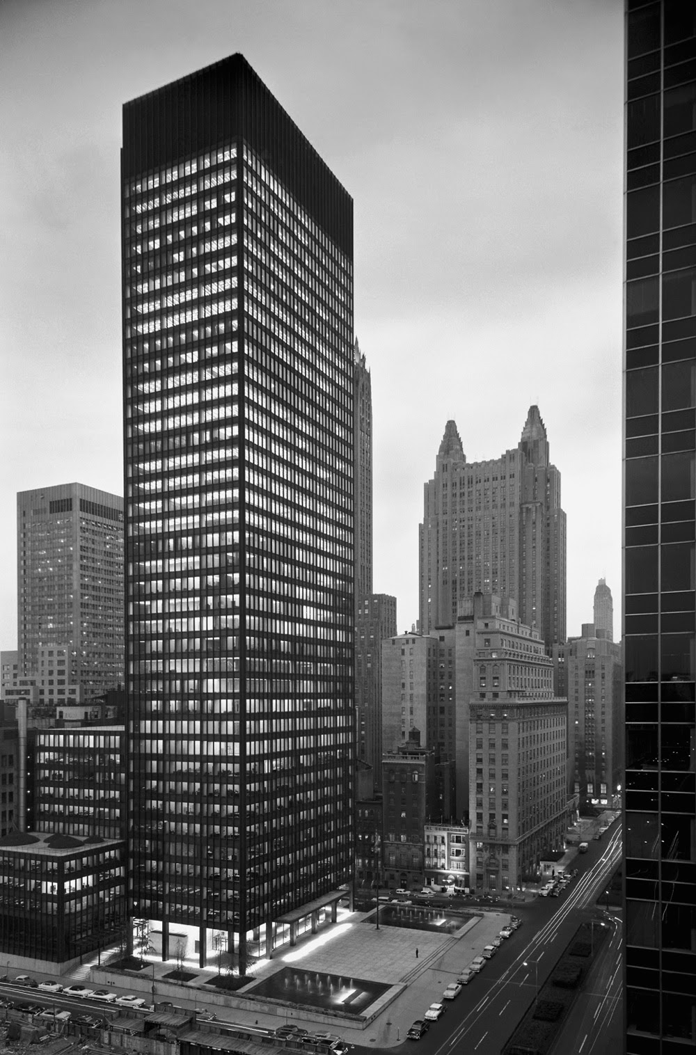
To understand Mies van der Rohe and his identity I will analyze some of his works. Starting with the Barcelona Pavilion to the Seagram building office tower in New York City.


Mies van der Rohe worked under Peter Behrens, a German architect as well who initiated Modernism with the AEG Turbine Factory in Berlin. But the first designed buildings of Mies where more old fashioned, all though he was strongly influenced by the Stijl. He wanted to create open, fluid spaces in buildings, in a way he wanted to break the box, diffusing the line between what lies outside and what is inside.

Mies was a visionary, he was a man who addressed structure, no hiding it, but actually address it on purpose. He made a design proposal of an Office Building in Berlin in 1921. It was revolutionary, this huge complex of glass and steel structure, which he draw so elegantly, yet his design almost fades or melts with the background. It was unfortunate that the proposal was not realized, but 8 years later in 1929 his name would become well known around the globe for his pavilion.

`
The German Pavilion at the World's Fair in Barcelona

In 1929 the World's Fair was held in Barcelona and Mies van der Rohe was the one who won the competition to build a pavilion, which would represent Germany.
So Mies came up with this design, new, never seen before, revolutionary and provoking. A huge slap cantilevered on 8 chrome steel columns and with only 3 partition, which would create space. Mies played with those partition walls, used them more as art pieces than just partitions. One of the wall, made out of Onyx, more expensive than the whole pavilion stands just in this space, no direct contact to the ceiling, showing and making people understand, this wall is not load bearing at all. It just stands there, as a piece of art.There is only one sculpture in the whole space, not even centered in within the Pavilion, but rather just put in one corner. The Pavilion itself became a sculpture, it became an exhibition by its own. Nothing more and nothing less, but truly god was in the detail. Every single approach, every single joint has been perfectly designed. Only the best materials have been used. This Pavilion really made his name famous and his reputation as a man with a few words.

Sketch for the Nazi Germany Pavilion 

With the Nazis taking the power in Germany came a new Ideology of architecture. Hitler, not a fan of modernist architecture, as it didn't please him and didn't show enough the power of the Third Reich. Hitler wanted to create an empire, for that, modernist architecture had no place at all. Rather that it was back to the roots again, back to the Greek and especially Roman architecture. 
Mies van der Rohe was the director of the Bauhaus at that time and he was more or less tolerated under the Nazi regime. Though later the Bauhaus was forced to close and Mies emigrated to the USA, he still tried to attempt to work in Germany. He competed for the German Pavilion project, following still his own stile, rather than just apply the favored Roman architecture. He again went with the modernist ideas of creating a Pavilion that would represent the Third Reich in Brussels. Though in the end it was not realized. But what it showed was the energy, that Mies was putting into his ideals of architecture, even under the hard and strict regime of the Nazis. Never leaving his ideas of modern architecture.

 Crown Hall, Illinois Institute of Technology College of Architecture, Chicago, Illinois

After Mies van der Rohe left Nazi Germany for good and starting a new life in the USA, he designed the Crown Hall for the Illinois Institute of Technology College of Architecture. It became one of the signature buildings of Mies as well and it also revealed the final ideal of Mies thought about architecture. To expose structure. In this Hall, there are no columns, made possible by using 4 huge steel trusses, from where the ceiling would hang down then. Mies didn't put any energy on trying to hide the structure at all, rather than that he wanted to show it. The structure is part of the architecture, it shows its function and becomes in a way an ornamentation. It is truth, and truth is beauty.


   The Seagram Building Office Tower in New York City

One of the last Masterpieces I want to talk about is the Seagram Building, done 2 years later after the Crown Hall. This buildings marks the pure expression of the so called International Style. It shows the structure and regularity. The structure material of the building is addressed outside as well, all though Mies clearly shows the different between load bearing structure and non. The vertical steel beams are cut, floating in the air and elegantly say, hey I am not load bearing.The space concept of the building is universal, meaning the plan is free inside and thus the space could become anything and any kind of function could happen.


Samstag, 15. Februar 2014

Art as a trigger for Modernism in Architecture

From what I learned so far is that Modernism has different variation of aspects, different kind of movements under the term of Modernism. Architecture in itself is art, how to design is art, but rather than using paintings, architects moved to the third dimension.


Kazimir Malevich, Black Square, 1915

Kazimir Malevich was the initiator of the so called Constructivism art movement. He wanted to express feelings through colors. It was the change of the political regime that triggered artists to come up with a new artist movement, to symbolize the new era after the death of the Zar family.
So why am I mention that? Well it was also the time of Wassily Kandinsky who is one of the most important and well known artist. Like Malevich, Kandinsky was very abstract.

 The Bauhaus in Dessau, Germany

Keyword Bauhaus. Kandinsky was a teacher at the Bauhaus till the closure of the Nazis in 1933. There he came in contact with the Constructivism, which affected then his way of expression through more geometric forms. Another famous artist who worked as a teacher at Bauhaus was Paul Klee, well known for his works in Expressionism, Cubism, Constructivism and Surrealism.

So there are two famous, well known artist which worked at the Bauhaus, whose Manifesto proclaimed :"the ultimate aim of all creative activity was building." It may sound like a joke despite the fact that in the first years of Bauhaus, there was actually no Architecture class at all. Nevertheless the idea was to combine crafts and fine art together, which eventually then manifested itself in the expression of architecture.

Walter Gropius intended to create a "total work of art in which all arts, including architecture, would eventually be brought together."

So to sum up my conclusion. Art is not just paintings on Canvas, it is the creativity which manifests itself in different, various aspects. Various art movements, craftsmanship, architecture, there are all part of what we call art. I think that art triggered the way architect thought about designing as space immensely. After all movements like Constructivism go with abstraction and simplicity, like Adolf Loos wanted architecture to be as well. So the idea, to create a new sort of expression through logical simplicity, swapped from one part of art to another. It is more of an exchange network, paintings affect architecture, architecture affects painting.

I agree with Walter Gropius, that art in the should be brought together and combined, to achieve the ultimate design. And the era of that time made this all easier in my opinion. Before architecture was all about the classic architecture, do it like the Roman and Greeks, and then again and again and again. Like a never ending loop. So with the start of the new art movement there was a chance of change of the way architects thought about architecture. Like i mentioned before, Adolf Loos claimed ornaments to be a crime and that architecture should stop copying and rather come up with a new ideology.

And here is where art also comes into the game, as many variations of 'Modernism' are spread, like Constructivism in Russia or De Stijl in the Netherlands, who came up with there own language and way of expression, but with the ideology of change and new ways. This all generated the machine of the Modernism in Architecture.

In a way i want to say that inspiration can come from anywhere, but to get inspiration we have to know different kinds of aspects of art, understand intentions of artists as well as the historical worth behind it. If we understand all those aspects better, I think that then we are able to understand and make better design.


Link to Documentary Bauhaus in Dessau

Montag, 10. Februar 2014

Ornament and Crime by Adolf Loos

Well I was reading the manifesto of Adolf Loss and it was shocking, how much he hated ornaments. It sounds like a child who doesn't want to eat his broccoli and thus things they should vanish.
But I agree with him, simplicity is what makes me look at modern architecture and don't get sore eyes.

Truth is beauty - beauty is truth

I think that especially the radical comparison between ornament and crime, or also ornament is crime, made such an huge impact on Modernism. Loos stated that the child is amoral as well as the Papuan, who tattoos his skin, but is not an criminal due to the fact that he slaughters his enemies and devours them. But the modern man tattooing himself would, on the other hand then, be a criminal.
To make it short, he states that if criminals wear tattoos on the skin as part of ornamenting themselves, then making ornaments on buildings would be the same. The architect would be a criminal, the building he designed would become crime against humanity. And I have to agree with Loos. I understand that, as an architectural student, we should learn about the history of architecture, to grasp the idea of their concepts at that time. But going into detail like knowing the Greek orders? That is not what I want to memorize. 


Unfortunately like all others who were masterminds and first to do some changes, Loos wouldn't get the agreement of what he stating. The Building Goldman and Salatsch Store in Vienna by Adolf Loos for an example was an attempt to get rid of useless ornaments and show functionality. The clear language of the upper housing floors with is contrast of the white painted facade and the minimal held windows had been totally disrupted by some ridiculous window sill, which Loos had to put on, because the emperor was afraid, the building wouldn't correspond with the neighboring  buildings. So he had to scar his own creation.


But what made his manifesto now having such huge impact on the way how architects thought at that time? Well throughout the world, there were others, who like Adolf Loos thought about the idea of an simple, functional style. In Italy the Futurists were fascinated by speed and movement as well as into industrialization, forms of cars, boats, planes, objects which show technical progress and that the design / form follow answers to the functionality.


That is what Peter Behrens did with the AEG Turbine Factory in Berlin. A building, which had a strong influence on the so called revolution of architecture, initiating the time of Modernism. Its a building, so simple held, we can understand by following the forms and shapes, what the purpose of the building is, to enclose the huge turbines of the so called company. It expresses what is inside.


In a way it is understandable why there was the desire of a change. It is now a 100 years ago when the world was at war; the World War I. Cities burned down to the grounds, a new era of architecture had to come, one which wouldn't anymore be unnecessary decorative, but responding to the needs of the people. Building which were functional, serve the purpose and could be mass fabricated. Like for example the Dessau Törten settlement by Walter Gropius


As a rational guy I always saw beauty in simplicity and forms. I can feel the intense hate rate that Adolf Loos had on the ornaments, all though I have to disagree with him under the term that not all tattooed men are criminals as I call myself one of those few who "decorated" themselves.
But it is this full of passion, simple wording and exaggeration that made the people thoughts shake. And it is this manifesto that made the ideology of architecture finally crumble and rebirth into Modernism, a more simple, functional and clean architecture I really appreciate. An appreciation because I think, that beauty comes from within, and a building is just an empty shell without what happens inside. And only a functional building can respond, in my opinion, to beauty.